Epic beer deserves epic branding
Branding and Packaging for the Calabogie Brewing Co.
MARSWorks took on a welcome challenge to create the brand and packaging for a new local craft beer company – the Calabogie Brewing Company.
We were brought on by our friends at Extension Marketing to create an identity that would stand tall in the crowded craft beer market.
We started by immersing ourselves in the craft beer world, performing market research, consumer research and competitor analysis. Our team conducted interviews, and spent time in various retailers so we could study Calabogie’s competitors first hand.
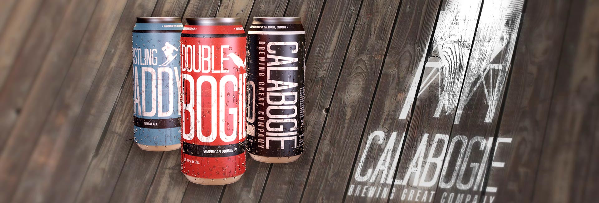
While most craft beers used detailed illustrations and graphics, our strategy was to use a simple, bold design. Using a bright colour palette and large bold font faces for the product labels, customers can easily identify the type of beer and, most importantly, the Calabogie name.
Visit CalabogieBrewingCo.ca.


The logo we created followed the brand strategy; simple and bold. The grain silo is a strong symbol that reflects the natural ingredients that are used in all of Calabogie’s products. A real version of the grain silo sits outside the Calabogie brewery and is a landmark for all people in the area looking to enjoy a truly epic beer.
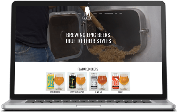
Once the branding design was ready, we created a simple and striking WordPress website, which we continue to support as needed.


